Whether you are an eCommerce startup or an already established business in this industry, you know that you need to sell in order to survive.
But hey, this is what everyone else knows, so you can hardly depend only on this capitalist common knowledge to boost your conversions and sales.
What you also know is that a happy customer is a loyal customer. Even though this is common knowledge as well, not many eCommerce websites actually do their best to optimize the entire eCommerce user experience.
Optimizing your website is definitely one of the most important things you can do increase conversions. The better experience your customers have while browsing your website, the more likely they are to buy your products.
Luckily, you don’t have to make crucial changes on your website in order to achieve noticeable results. There are a number of details that you can tweak to successfully optimize your website for conversions.
We have prepared six essential strategies that you can use to boost your eCommerce website conversion. However, before we jump to them, you should know what a realistic conversion rate is.
What you should aim for
On average, eCommerce conversion rates are 1–2 percent. Now, don’t let this ‘low’ conversion rate discourage you because it is not low at all.
As we said, it is the average conversion rate. In fact, you are most probably winning your sales 2% of the time at the moment. This means that if you have 10,000 visitors a month, 200 of them actually buy something on your online store.
However, even though this may be your current conversion rate, your ultimate goal should be at least a 5% conversion rate. To achieve this, you need to optimize your website and social media channels, work on lead generation and marketing strategies, and, of course, create an eCommerce online store that will bring you conversions.
Now that you know what your goals should be, the time has come for you to learn the six steps that will help you achieve them.
1. Optimize your homepage
Unless a person searches for a specific product or gets directed to one of your landing pages, your homepage is what they see first.
Don’t waste your homepage potential by adding irrelevant content to it. Instead, include your best-selling products, special offers, and trending categories and you will keep many more visitors on your website. This allows you to control where your visitors go next and create a path you want them to follow.
If you fail to lead your visitors, they are much more likely to get confused and leave your website, which is something that you must not allow under any circumstances.
To prevent losing your visitors, you can promote:
- A top-selling product
- A deal of the day
- A special offer
If you want to experiment with more than one homepage and see which one works best, try A/B testing. This method does require both time and effort, but it can give you some invaluable answers if you regularly track your micro conversions.
To give you an example of a flawless homepage, the undisputed champion in the best eCommerce homepage category is Amazon. It promotes hot categories like Get ready for college, Deal of the Day, and Find your next show. It even has a sign-in button in the same row so that you can easily sign in to your account and order whatever you want.
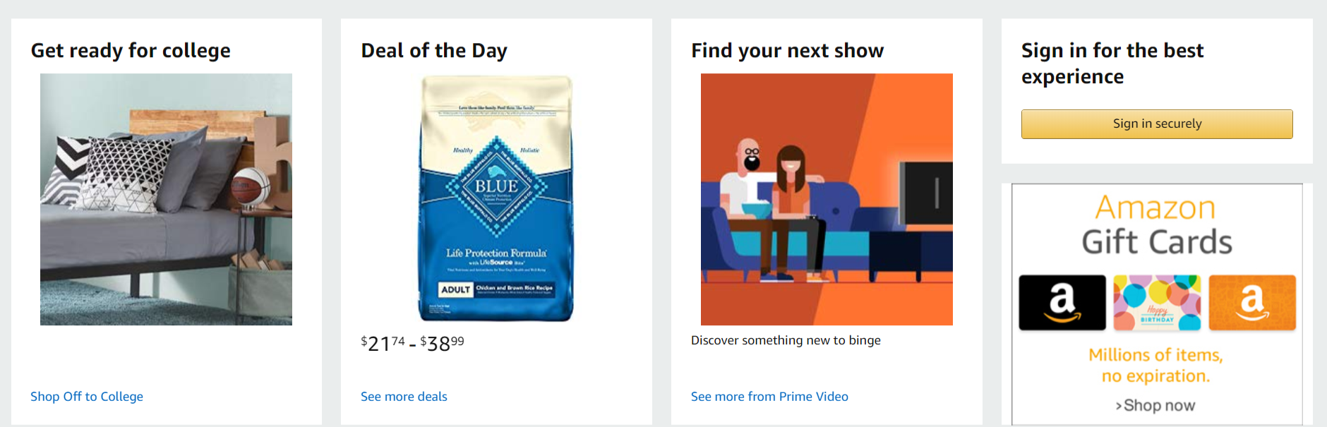
This is not to say that you have to copy Amazon. As the matter of fact, you shouldn’t even try to do it because you will probably fail. You have your own website and your own products, so try to create your own homepage which will ‘pull’ your visitors deeper into your website.
People who visit your website are your easiest leads. Why not use this to your advantage and turn them into sales?
Your homepage is the right place to swipe them off their feet and practically announce that their user experience is your primary concern.
2. Simplify your website navigation
Most people will find your products by browsing your website. Therefore, it is essential that your website has simple product categories which can be browsed logically.
This is not to say that you shouldn’t have a search option. The search bar is important too, only not as important as your product categories.
In fact, there is a difference between people who search eCommerce websites and those who use category browsing. The former usually already know what they are looking to buy, while the latter have no specific idea about the product they want.
Since there are many people that need to be shown clear directions, you need to create very simple product categories, especially if you work in an industry where product design is essential. More than in any other industry, clothing and apparel require to be logically sorted and divided into categories.
Here is how Tommy Hilfiger solved this problem:
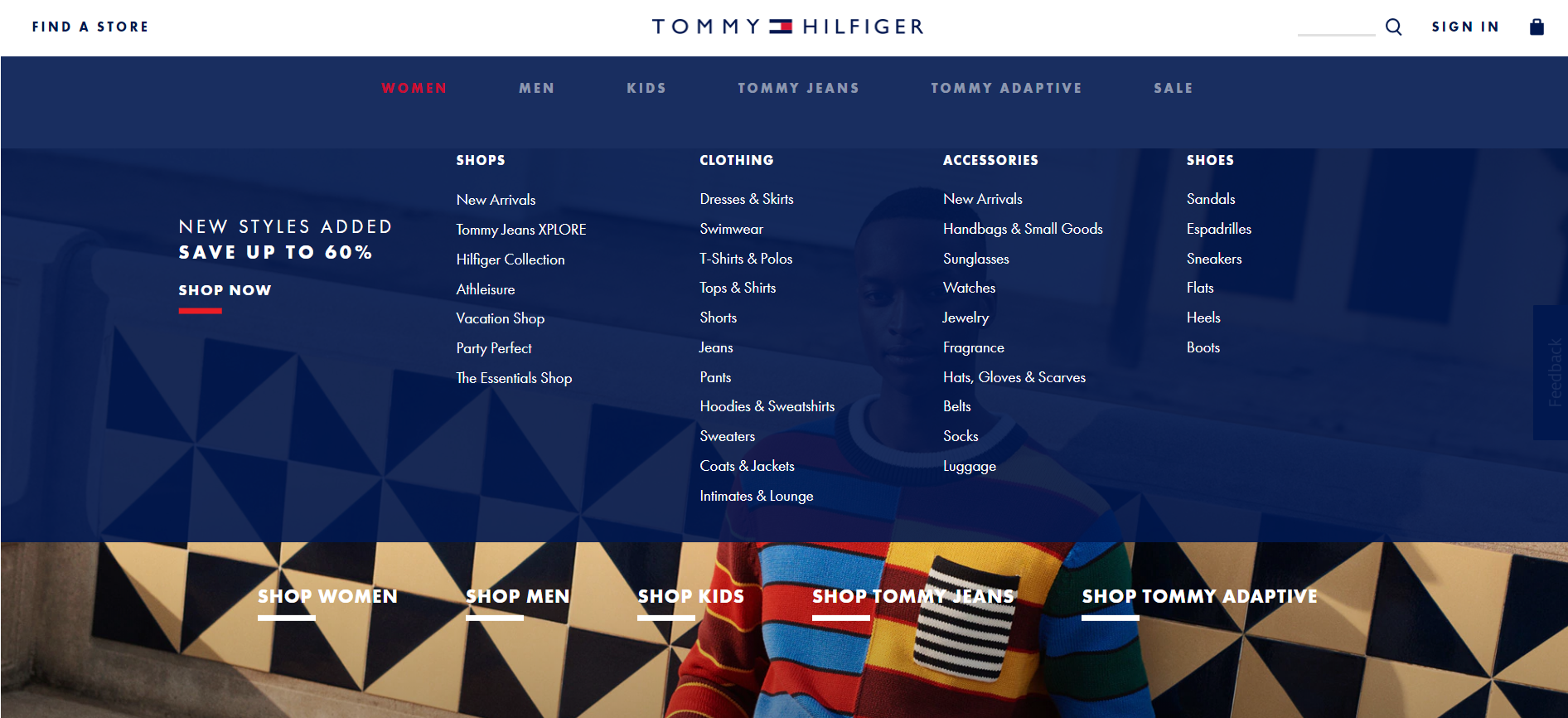
On their homepage, you can choose a specific category. Also, their subcategories are very clear and easily differentiated.
Note that they do have a search bar as they know some of their visitors will use it. However, it is barely noticeable, in the upper right corner of their homepage, which says a lot about its importance.
In the industries where product design is the most important factor, most people will browse eCommerce websites until they find what they want. Now that you know this, you can create a website with great navigation and lead your visitors to the product they want.
3. Optimize your product pages
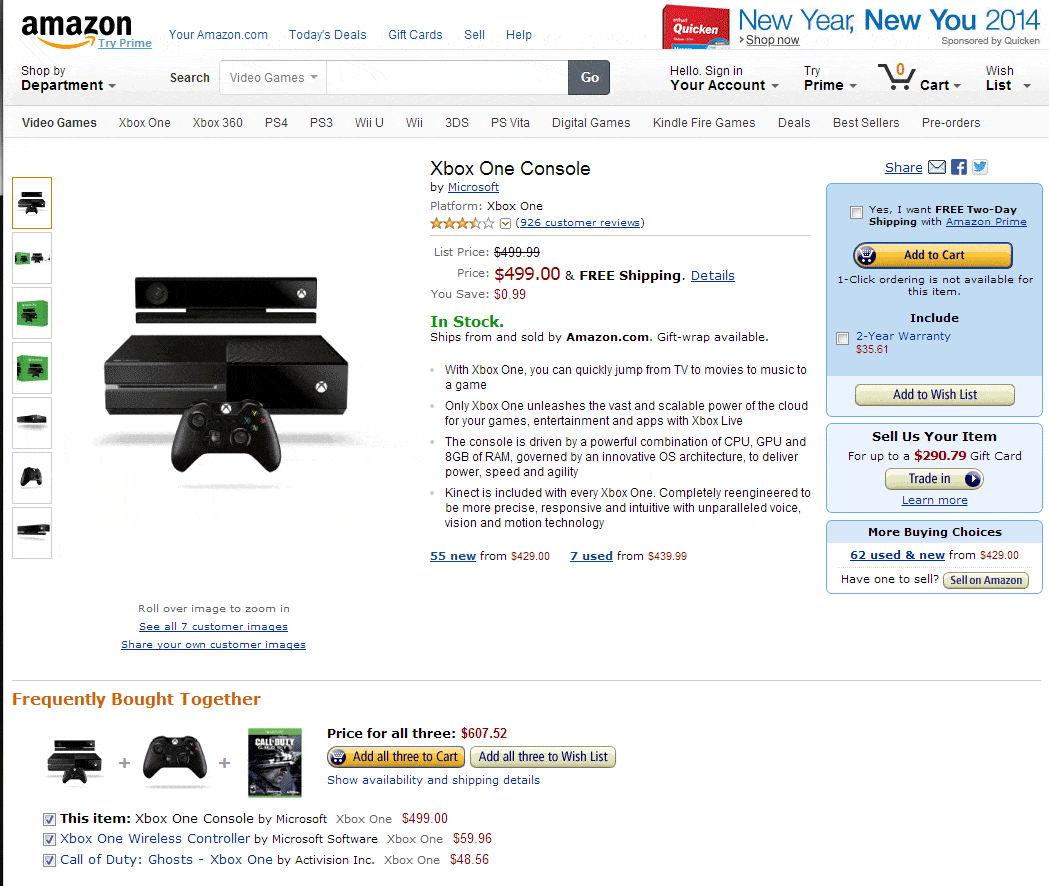
Once again, Amazon proves it is the king of eCommerce. This is what one of their product pages looked like:

Once your visitor opens a product page, they need to know everything about the product: what it is, what it looks like, how it is used, how other people rated it, and so on.
This gives you a number of ways to make your product pages so informative and memorable that your visitor wants for nothing except for your product.
To optimize your product pages, think about the following:
Informative product description
After your homepage, your product pages are the most important on your website. They need to have a lot of information about your products so that they can convince your customers that is the right product for them.
Make sure your descriptions are clear and to the point. You can have two descriptions: short and long—one capturing the essence and the other leaving the visitor with no questions left.
High-quality product images
Have you ever heard of the proverb A picture is worth a thousand words? Of course you have. This saying has been repeated for so many times that it should be banned for at least the next ten years.
But, there is a reason why everyone has been using it—it is perfectly true. Humans are visual creatures and we are much more likely to respond to something if it contains visuals.
People want to see what they are getting, so having high-quality product photos is a must. Make sure you have a lot of photos, take them in context and from different angles, and make them zoomable.
Videos
People love videos because they can tell them much more than photos. After all, a video is a motion picture.
Adding a video of your product will significantly increase your conversion rate. What you can also do is shoot a video tutorial so that your visitors know how the product is used. If you help them, they are much more likely to buy from you.
Honest reviews
How often do you read product reviews? Probably much more often than you can remember. Almost 60 percent of online customers read online reviews, and this information alone should be enough for you to start including reviews on your product pages.
Make sure your product pages have descriptions, photos, videos, and reviews. These are must-have for all eCommerce websites.
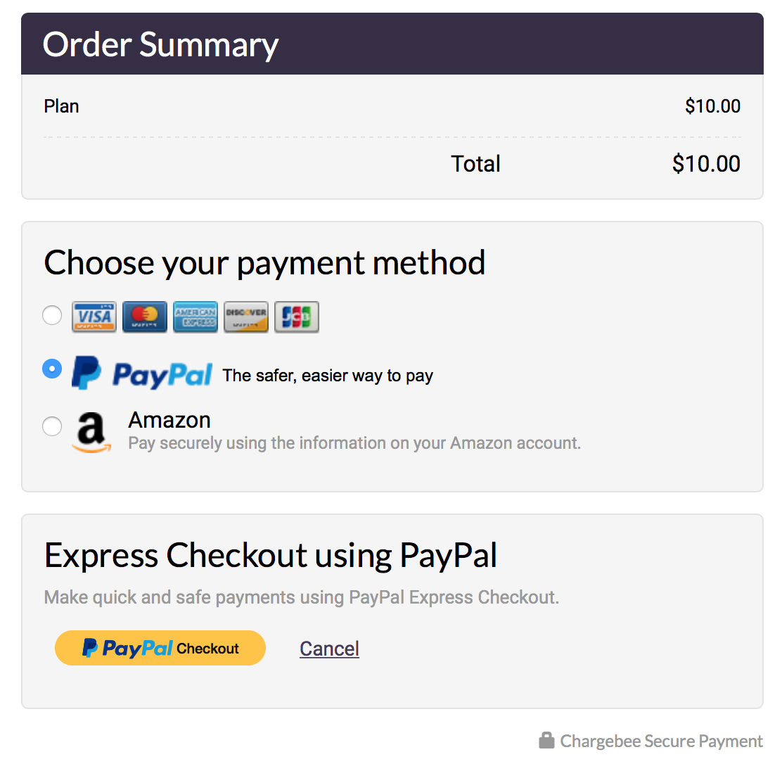
4. Offer multiple payment options

People like having more options, especially when it comes to giving up their money even if they are exchanging it for a world-class product.
With the identity theft scandals that have occurred recently, some people are rightfully unwilling to make online payments with their credit card.
In addition, there are people who will cancel the purchase if their preferred payment method is not available.
Instead of offering your customers only one payment option, let them choose between their credit card, PayPal, and maybe even Bitcoin. This way, even though some regions have limited payment options, your customers will be able to complete their purchase no matter where they live.
If you have a local or regional store, you can also add a phone number, fax, or email address that your customers can use to order your products.
Giving your customers all these options will cost you little, while it can bring you a lot of sales. When you give someone more options, it means that you let them decide. Customers see this as a sign that you care about them and they will always reward you for this.
5. Provide all the information your customers need
Would you buy something if you had uncertainties about the purchase?
Questions like Is this purchase safe? Can I do returns? and When will I get my product? are often invading your customers’ minds while they are checking out.
If the visitor has never ordered from you before, they will have some uncertainties that you need to address if you want them to buy your product. The easiest way to do this is to give them all the information they need before they check out.
This is how you can clear their doubts:
- Let them know how long they will have to wait to receive the product
- List a clear price for each item (without hidden fees)
- Let them know if the product is out of stock and when it will be available again
- Specify the item’s weight and dimensions
A customer who knows everything about their purchase is much more likely to proceed with their checkout.
Besides giving the information your visitors need to know in order to complete a purchase, you can also give them the ‘information’ you need them to know.
Using FOMO to increase your conversion rate is a very effective trick. FOMO (fear of missing out) is widely used on product pages, in email newsletters, to boost app downloads and in many other cases.
You don’t have to use FOMO only during the checkout process but anywhere on your website. This is a simple psychological trick that has proved rather successful at increasing the number of conversions.
6. Make your checkout simple
Even though you can’t fully prevent shopping cart abandonment, you should create a simple checkout form which will significantly lower your cart abandonment rate.
These are some of the ways you can tackle this issue:
Use auto-fill forms
If the visitor has already registered for your website, this feature will keep their information and automatically fill them into your checkout form.
Use a persistent shopping cart
This way, you will keep all the information about your visitor’s checkout process. When they return to your online store, they will be able to continue their checkout from where they left it.
Give examples for form fields
This way, your customers will clearly understand what they should fill in.
Never ask for registration
Don’ require your customers to register in order to check out as this will make many of them cancel their purchase.
Never charge for shipping
One thing you should never do is charge for shipping as this is a huge conversion killer. Free shipping is becoming a standard in the eCommerce industry. It is up to you to decide whether you want to be one of the websites that people come back to because of free shipping or the website that everyone avoids.
If you can’t afford free shipping, you may want to consider FOB shipping. However, this may be seen as a hidden fee by your customers. In case you opt for FOB shipping, you should inform them that they will pay a part of the shipping costs.
These strategies are used by all eCommerce websites that have outstanding conversion rates. Amazon and Tommy Hilfiger are only a couple of them.
If you follow this advice, you can improve your visitors’ entire user experience ‒ from your homepage to their checkout. Make sure you improve as many aspects of your website as possible and rest assured that your conversion rate will follow.
